

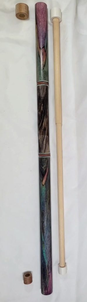
I present (first image below) the rough draft, which uses a blackish handle section made of beech, like the rest of the cue. The reason I like it is that because it is beech, it has the same movement going on. It’s like a black and white version of the rest of the cue. The rings are green, purple, and orange for some pop. The rings are a rough draft.
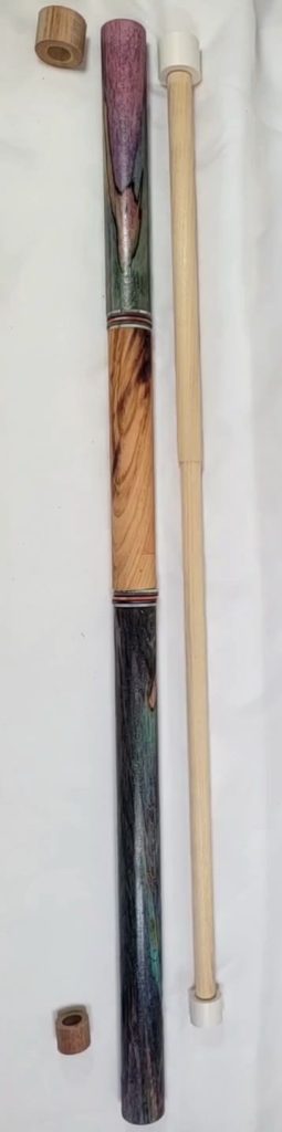
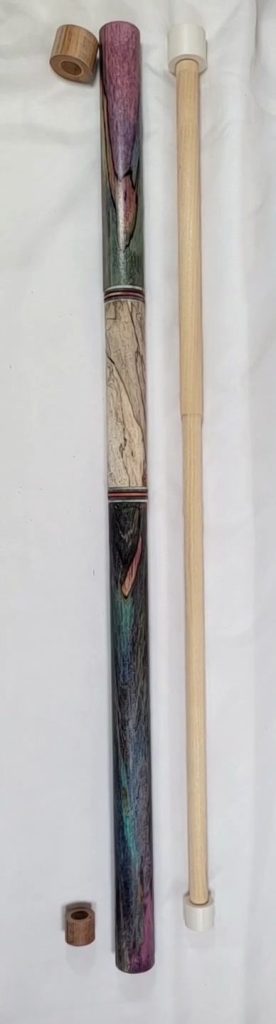
The problem we have to solve while also choosing the handle is this: you notice the core to the right? That’s 30 inches. That shows how much wood needs to be removed from somewhere. Keep that in mind while viewing the different pieces. The smaller the handle, the more of the purple wood of the butt sleeve and forearm.
Also, two choices for collars. The left is brown phenolic. The right, white Tomahawk. Keep in mind we can always bring black phenolic back into play.
What about the negatives? As I said in my text, it’s moody.
That’s the stick you take out when you want to leave bruises on your opponent’s ego that last til next summer.
It could be named A FACEFUL OF PUNCHES.
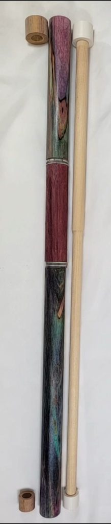
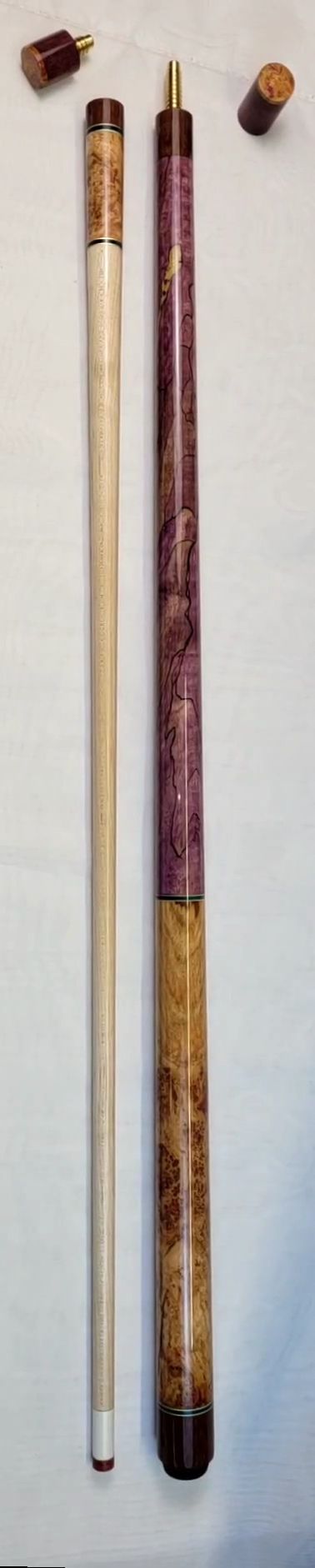
My next thought? At one point you wanted to see more purple in the handle. Since then I’ve gotten some purple heart that could be useful as a handle.
Looks good. The flat color lets the eye relax, find a foodhold, before attempting to behold the rest of the cue.
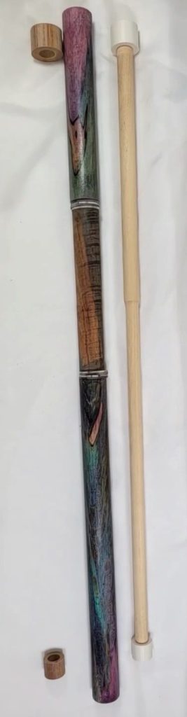
Next thought: This tiger maple has blue that matches the blues in the bubble gum (color of the rest of the cue, my friends).
The ripple pattern is so different from the action in the rest of the cue, the handle stands out without making a jerk of itself. Interesting but not overbearing. I’d name it RIPTIDE.
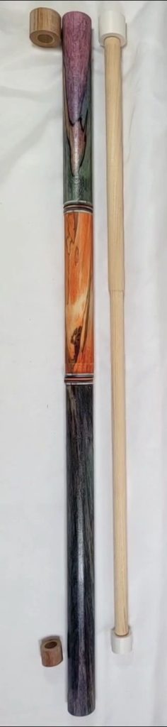
Then there’s always orange. I’ve never seen a cue that didn’t both need and deserve orange. Not all cues can handle it, though. This one can. Were I building the stick for myself, I’d likely do it with orange and name the cue: SHE SAID YES LETS PARTY
Where’s the comma go, right?
Next there’s black cherry. I added this for consideration because it is plain, no dye, and the colors work with the lightest segments in the bubble gum. If the cherry color is interesting, I have a dozen pieces we could look at, if the grain in this one is distracting. My eye disfavors it because the lines seem to compete with the rest of the cue, making it a little noisy. I’d name this one QUIET PLEASE!
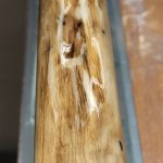
Then there’s spalted maple. Both the color and the squiggle pattern are so different they relieve, refresh and engage, while allowing the eye to cool off from the intensity of the purple. This is a happy stick. The one that draws stares and smiles.
Picks up chicks.
This is the cue that says LIFE IS ART
All right, folks, which handle would you choose, and why?


One comment
I love contrast, if this were my build, I’d go for the handle right after she said “ Let’s Party” now that’s contrast and will will without doubt, turn heads. I have no doubt Clayton will do it justice regardless of choice. Onward and upward with the build.