The first two images show the entire slate. The next images zoom in for a closer look to help distinguish where things might go together vs where they clash.
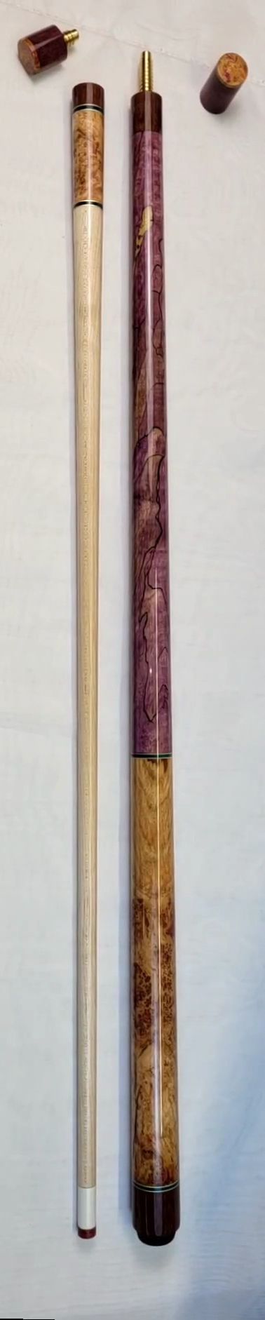
This time we add most of the “bubble gum” cook, to see where purple might look good. Since the bubble gum has green in it as well as purple, I added 3 pieces of green. I also added a piece of purple maple with lots of squiggles, piece 7, and a cue that contains nice purples that hasn’t been glued, in case any of those pieces would look good.
Even where colors clash, that isn’t necessarily a bad thing. We just have to make sure the clash is what we want. Then we call it “Pop.”
My thought — to get purple to work with blue, we could use rings with inlays of alternating blue and purple to soften the clash and set off whichever piece is less dominant. Some of the purple/green have bluish hues that work well with piece G, the spalted maple burl.
I’m beginning to sense this is going to be a remarkable cue. We have so many dynamic pieces at play, the only challenge will be to our imaginations to figure out which layout best shows off the colors. In an artistic sense, we’re more figuring out the frame than the picture. The layout will make this cue amazing.